sme_contrib.plot
[1]:
# !pip install -q sme_contrib
import sme_contrib.plot as smeplot
import pyvista as pv
from pyvista import examples
import sme
from IPython.display import HTML
from IPython.display import Video
from matplotlib import pyplot as plt
pv.set_jupyter_backend("html")
Load and simulate example model
[2]:
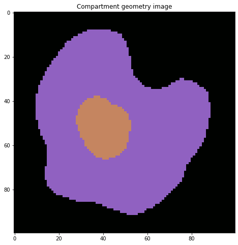
model = sme.open_example_model()
fig = plt.figure(figsize=(16, 8))
plt.imshow(model.compartment_image[0, :])
plt.title("Compartment geometry image")
plt.show()
results = model.simulate(100, 1)
species = ["B_out", "B_cell"]
Plot resulting species concentration
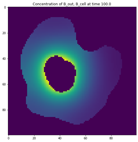
Use default colormap
[3]:
fig = plt.figure(figsize=(16, 8))
smeplot.concentration_heatmap(results[-1], species)
plt.show()
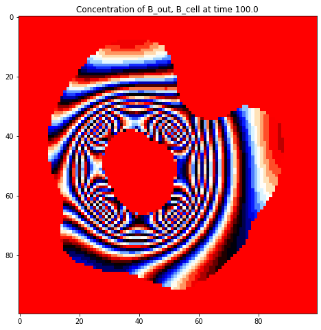
Use a built-in matplotlib colormap
[4]:
fig = plt.figure(figsize=(16, 8))
smeplot.concentration_heatmap(results[-1], species, cmap="flag")
plt.show()
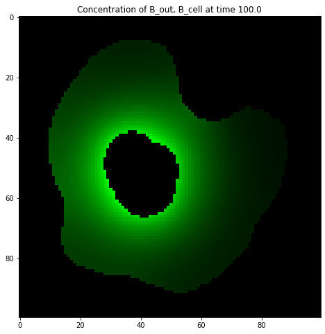
Create your own colormap
[5]:
# make a black -> green colormap using sme_contrib.plot.colormap:
cmap = smeplot.colormap("#00ff00")
fig = plt.figure(figsize=(16, 8))
smeplot.concentration_heatmap(results[-1], species, cmap=cmap)
plt.show()
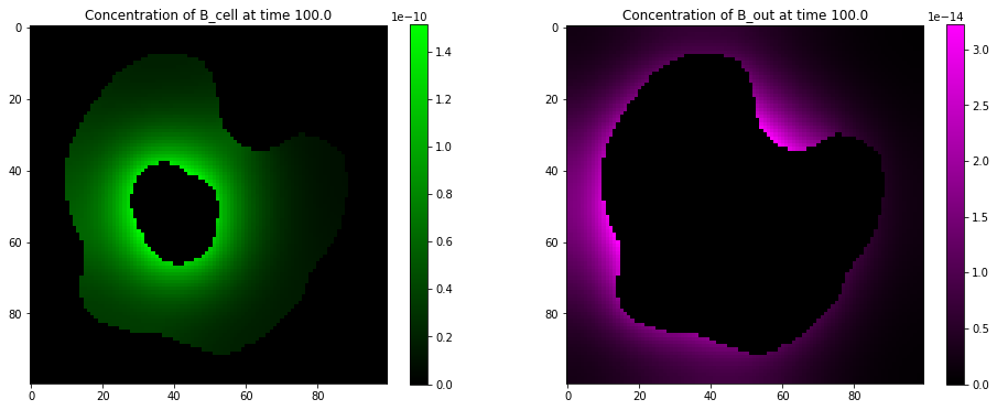
Display on existing axes with colorbar
[6]:
fig, (ax_l, ax_r) = plt.subplots(nrows=1, ncols=2, figsize=(16, 6))
ax_l, im_l = smeplot.concentration_heatmap(
results[-1], ["B_cell"], cmap=smeplot.colormap("#00ff00"), ax=ax_l
)
ax_r, im_r = smeplot.concentration_heatmap(
results[-1], ["B_out"], cmap=smeplot.colormap("#ff00ff"), ax=ax_r
)
fig.colorbar(im_l, ax=ax_l)
fig.colorbar(im_r, ax=ax_r)
plt.show()
Plot animation of species concentration
[7]:
anim = smeplot.concentration_heatmap_animation(results, ["B_cell"], figsize=(8, 6))
Display as html5 video
[8]:
HTML(anim.to_html5_video())
[8]:
Display as javascript widget
[9]:
HTML(anim.to_jshtml())
[9]:
Plot concentrations on 3D grid
The API for 3D plotting has two layers:
the low-level function provide a high degree of customisability, but need more code to get them to work:
facet_grid3D: two low-level functions that map a dictionary of name->plotfunctions over a dictionary name->data, where both have to have the same keys. For each key in the data dictionary, a single plot pane will be created.facet_grid_animation3Dis an animated version of this function that creates an .mp4 file for and receives a dictionary of name->data for each frame of the animation over which the dictionary containing the plot functions is then mapped in each frame.
concentration_heatmap3Dandconcentration_heatmap_animation3D: These high-level API directly usessme.SimulationResultobjects as data input, but only plots concentrations by default. These are wrappers around the low-level functions that provide default plotting functions for each pane and handle the data preparation for each pane automatically.for switching between interactive and static plotting, use
pv.set_jupyter_backend('trame')for interactive plotting, orpv.set_jupyter_backend('static')for static plotting.
High-level 3D plotting functions
We can plot 3D simulation results in much the same way as 2D results. however, 3D plots use pyvista as backend, not matplotlib.
[10]:
model_file = "./model.xml"
model = sme.open_sbml_file(model_file)
results = model.simulate(500, 10)
species = list(results[0].species_concentration.keys())
[11]:
smeplot.concentration_heatmap3D(
simulation_result=results[10],
species=["A_nucl"],
cmap="tab10",
show_cmap=True,
).show()
2026-04-27 09:48:10.374 ( 11.343s) [ 7A58BE2F0B80]vtkXOpenGLRenderWindow.:1460 WARN| bad X server connection. DISPLAY=
Animate concentations on a 3D grid
[12]:
vidpath = smeplot.concentration_heatmap_animation3D(
filename="test.mp4",
simulation_results=results,
species=["A_nucl"],
cmap="tab10",
)
[13]:
Video(vidpath, embed=True, width=800, height=600)
[13]:
Advanced: Low level functions
We now dive a little bit deeper into the 3D plotting API. The high level functions used above are in fact just thin wrappers around more general low-level plotting functions that work a bit like the FacetGrid functions in seaborn, but for 3D plotting.
In the following, we plot some example functions to show the functionality of the facet_grid3D functions. We first define the functions that are applied to each pane in the grid:
first, we get some example data to illustrate how to use the plotting functions.
[14]:
def exampledata():
armadillo = examples.download_armadillo()
bloodvessel = examples.download_blood_vessels()
brain = examples.download_brain()
return {
"armadillo": armadillo,
"bloodvessel": bloodvessel,
"brain": brain,
}
datasets = exampledata()
[15]:
def plot_bloodvessel(label, data, plotter, panel, **kwargs):
plotter.subplot(*panel)
plotter.add_mesh(data)
def plot_brain(label, data, plotter, panel, **kwargs):
plotter.subplot(*panel)
plotter.add_volume(
data,
cmap="viridis",
opacity="sigmoid", # Common opacity mapping for volume rendering
shade=True,
ambient=0.3,
diffuse=0.6,
specular=0.5,
)
def plot_armadillo(label, data, plotter, panel, **kwargs):
plotter.subplot(*panel)
plotter.add_mesh(data)
These define what should be plotted in each pane. Then we put the it all together in the call to facet_grid3D, which connects the data to the plotting functions and creates the grid layout. The grid layouting is automated, and creates as many rows and columns as needed to fit all panes into a reasonable aspect ratio. These functions follow the open-closed principle, such that you can customize the underlying pyvista objects via plotter_kwargs and plotfunc_kwargs, for example. try to
zoom and rotate the resulting plots a little if they are not visible immediatelly.
[16]:
facetgrid = smeplot.facet_grid3D(
data={
"armadillo": datasets["armadillo"],
"bloodvessel": datasets["bloodvessel"],
"brain": datasets["brain"],
},
plotfuncs={
"armadillo": plot_armadillo,
"bloodvessel": plot_bloodvessel,
"brain": plot_brain,
},
linked_views=False,
)
facetgrid.show()
Making an animation functions works in much the same way, but we use a list of data dictionaries now, one for each frame.
We define a general plotting function that is used for each pane in each frame here for simplicity, but these can be different too, like shown above:
[17]:
def plotfunc(
label,
data,
plotter,
panel,
show_cmap,
cmap,
**kwargs,
):
# create a pyvista grid
plotter.subplot(*panel)
plotter.title = label
plotter.add_mesh(
data,
scalars=data,
label=label,
cmap=cmap,
show_scalar_bar=show_cmap,
**kwargs,
)
Then use it in the call to facet_grid_animation3D call. Note that we pass a list of data dictionaries now, while the plotfuncs dict stays a dictionary. You can use the plot function to customize lighting, perspective and more. See the pyvista documentation for more information.
[18]:
vidpath = smeplot.facet_grid_animation3D(
"testvid.mp4",
data=[
{species[i]: res.species_concentration[species[i]] for i in range(len(species))}
for res in results
],
plotfuncs={species[i]: plotfunc for i in range(len(species))},
cmap="tab10",
portrait=True,
linked_views=True,
)
[19]:
Video(vidpath, embed=True, width=800, height=600)
[19]: